
Granprotein - Naturale
Projeto de:
Valkiria Inteligência Criativa
www.valkiriaic.com.br
@valkiriaic
[EN] Some animations I developed together with the amazing team at Valkiria for the Granprotein – Naturale case.
Projeto de:
Valkiria Inteligência Criativa
www.valkiriaic.com.br
@valkiriaic
[EN] Some animations I developed together with the amazing team at Valkiria for the Granprotein – Naturale case.
The motion reinforces and connects all the project’s characteristics, bringing flavor, movement, and energy, creating a consistent narrative that aligns with its visual language.
[PT] Algumas animações que desenvolvi junto com o time incrível da Valkiria para o case Granprotein - Naturale
O motion reforça e conecta todas as características do projeto, trazendo sabor, movimento e energia, criando uma narrativa consistente que se encaixa com a linguagem visual.
Granprotein - Naturale
—
—
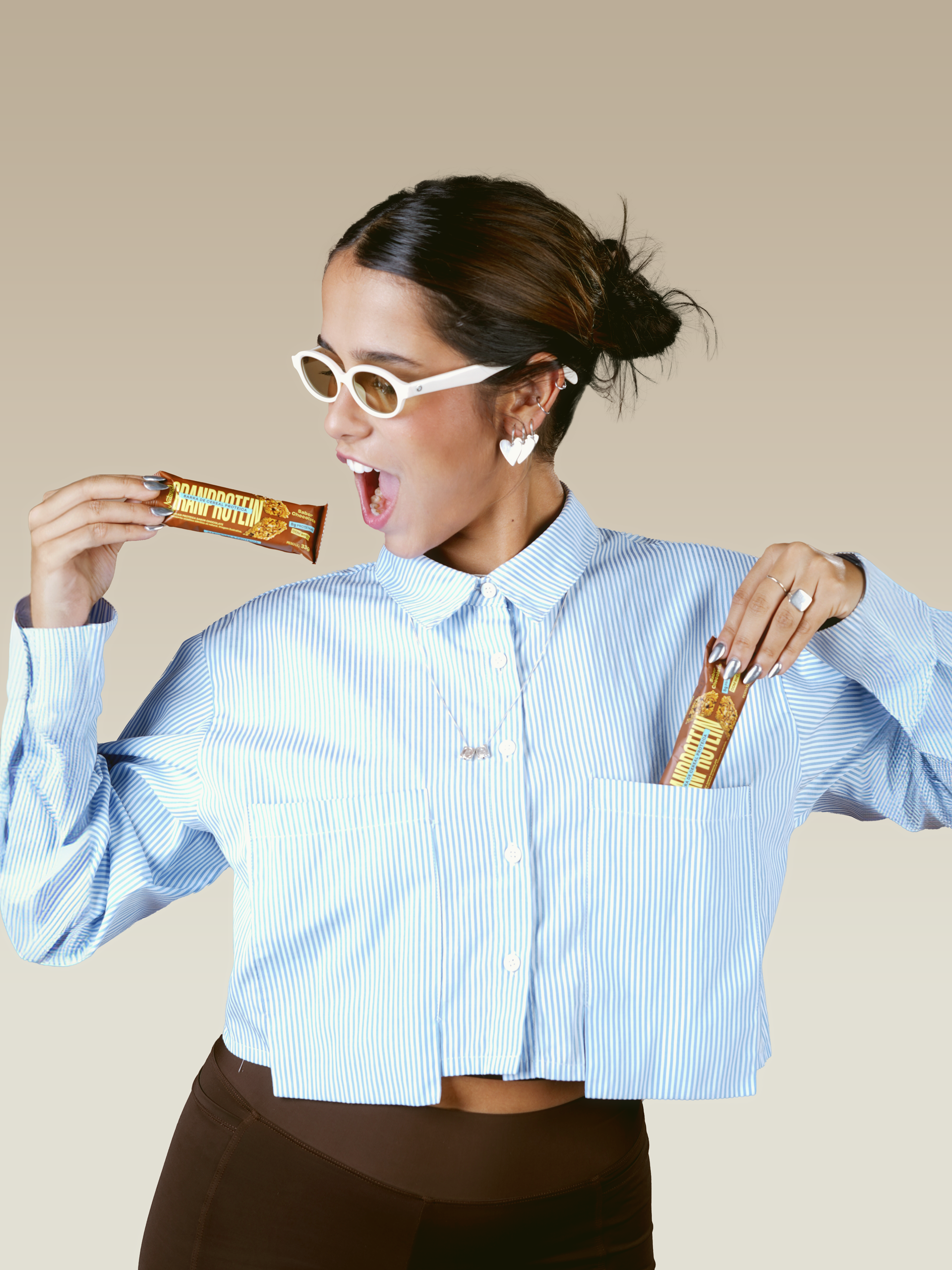
[EN] Naturale, a brand already recognized for its role in the healthy food market, invited us to create the identity for its new line of high-protein cereal bars, formulated with whey protein. The goal: to reach an audience that values nutrition and practicality — and to translate that into packaging with a strong brand presence and high shelf impact.
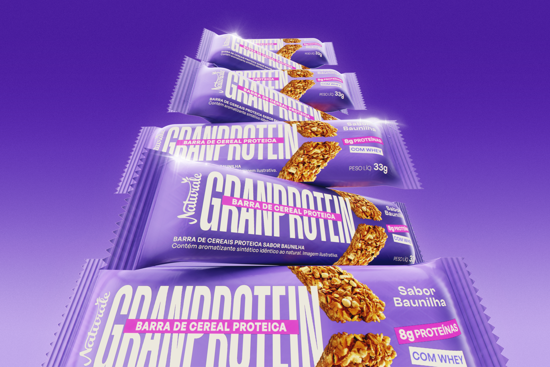
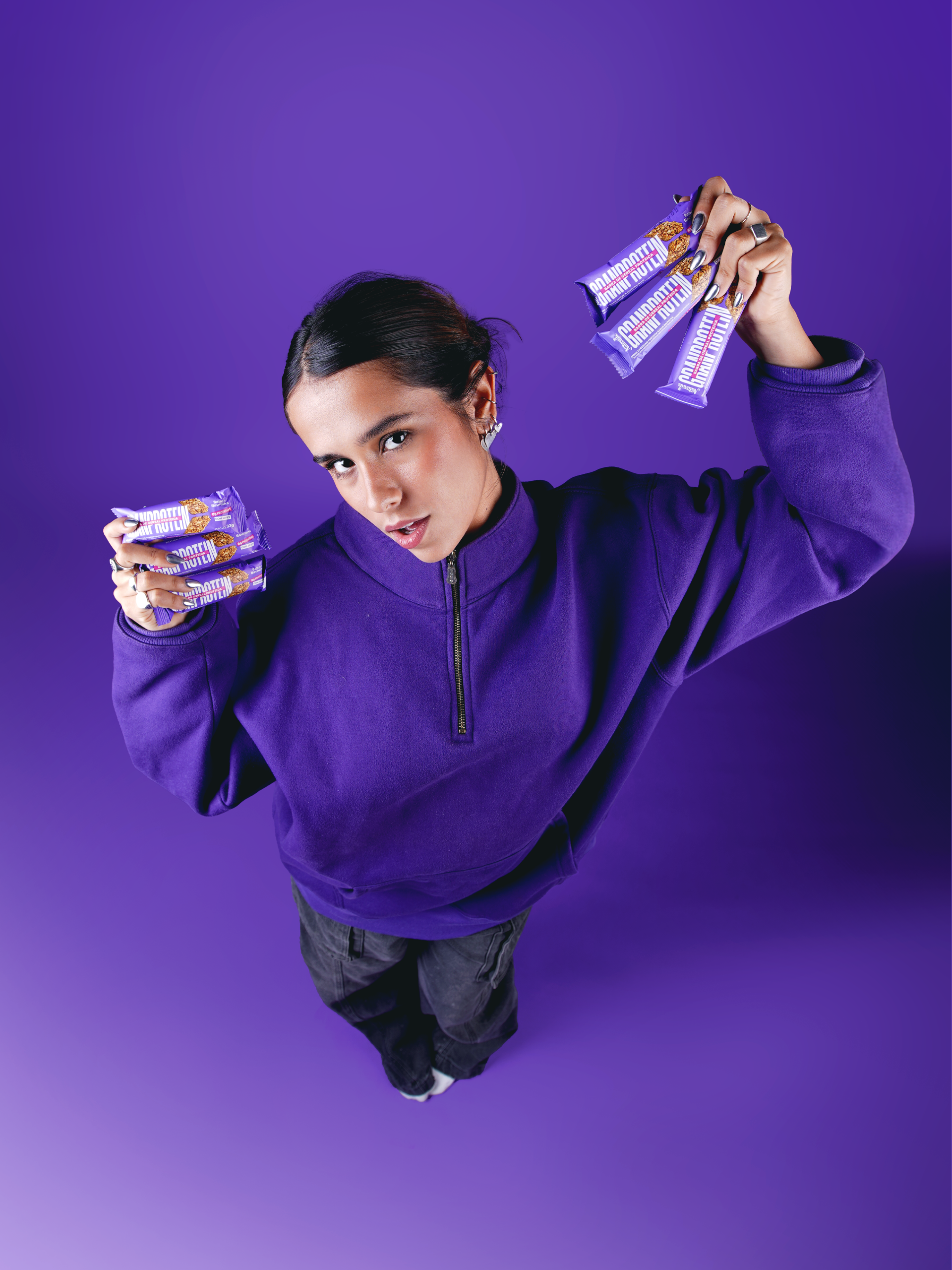
The visual identity of GRANPROTEIN was designed to communicate energy, movement, and flavor. We aimed to connect with people who identify with a fitness and healthy lifestyle. The product name occupies the center packaging to represent a true statement of strength. The elongated vertical reading enhances the sense of power and presence, while the information architecture organizes the product’s main attributes with contrast and clarity: “8g of protein,” “with whey.”
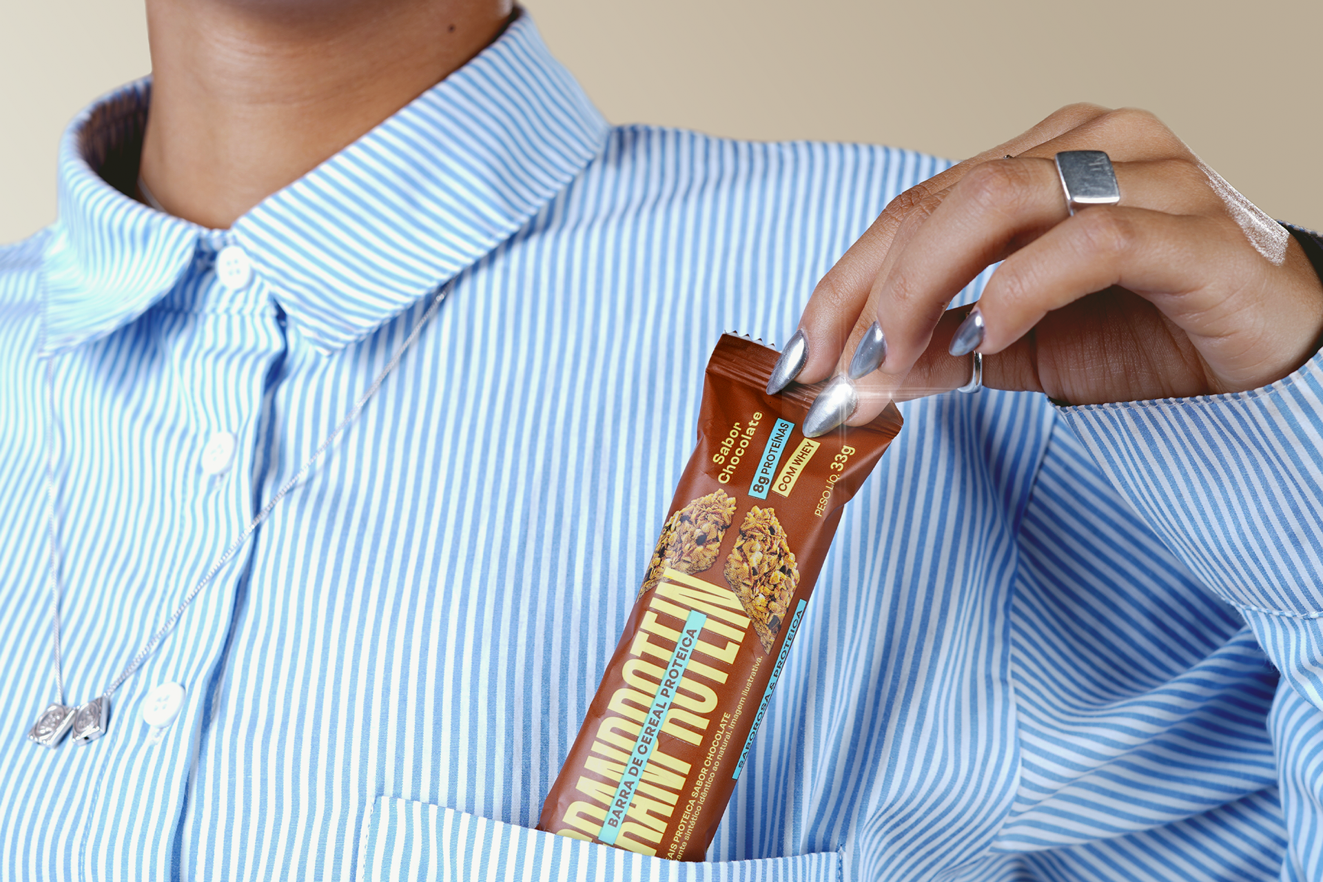
Each product flavor features a distinct and expressive color palette: for vanilla — a vibrant purple with neon pink accents; for chocolate — an earthy brown with green and blue highlights.
The graphic solution ensures visual impact and reinforces the product’s technical advantages. A project that connects design and health to drive choices at the point of sale.
[PT] A Naturale, marca já reconhecida por sua atuação no mercado de alimentos saudáveis, nos convidou para criar a identidade da sua nova linha de barras de cereal com alto teor proteico, formuladas com whey protein. O objetivo: alcançar um público que valoriza nutrição e praticidade — e traduzir isso em uma embalagem com forte presença de marca e alto poder de diferenciação na gôndola.
A identidade visual de GRANPROTEIN foi desenhada para comunicar energia, movimento e sabor. Buscamos nos conectar com pessoas que se identificam com o lifestyle de exercício e vida saudável. O nome do produto ocupa o centro da embalagem como um verdadeiro statement de força. A leitura vertical alongada intensifica a sensação de potência e presença, enquanto a arquitetura de informação organiza os principais atributos do produto com contraste e legibilidade: “8g de proteínas”, “com whey”.
Cada sabor do produto ganha uma paleta cromática distinta e expressiva: para o sabor baunilha - roxo vibrante com detalhes em rosa neon e para o sabor chocolate - marrom terroso com detalhes em verde e azul.
A solução gráfica garante destaque visual e reforça os diferenciais técnicos do produto. Um projeto que conecta design e saúde para potencializar escolhas no ponto de venda.
The visual identity of GRANPROTEIN was designed to communicate energy, movement, and flavor. We aimed to connect with people who identify with a fitness and healthy lifestyle. The product name occupies the center packaging to represent a true statement of strength. The elongated vertical reading enhances the sense of power and presence, while the information architecture organizes the product’s main attributes with contrast and clarity: “8g of protein,” “with whey.”
Each product flavor features a distinct and expressive color palette: for vanilla — a vibrant purple with neon pink accents; for chocolate — an earthy brown with green and blue highlights.
The graphic solution ensures visual impact and reinforces the product’s technical advantages. A project that connects design and health to drive choices at the point of sale.
[PT] A Naturale, marca já reconhecida por sua atuação no mercado de alimentos saudáveis, nos convidou para criar a identidade da sua nova linha de barras de cereal com alto teor proteico, formuladas com whey protein. O objetivo: alcançar um público que valoriza nutrição e praticidade — e traduzir isso em uma embalagem com forte presença de marca e alto poder de diferenciação na gôndola.
A identidade visual de GRANPROTEIN foi desenhada para comunicar energia, movimento e sabor. Buscamos nos conectar com pessoas que se identificam com o lifestyle de exercício e vida saudável. O nome do produto ocupa o centro da embalagem como um verdadeiro statement de força. A leitura vertical alongada intensifica a sensação de potência e presença, enquanto a arquitetura de informação organiza os principais atributos do produto com contraste e legibilidade: “8g de proteínas”, “com whey”.
Cada sabor do produto ganha uma paleta cromática distinta e expressiva: para o sabor baunilha - roxo vibrante com detalhes em rosa neon e para o sabor chocolate - marrom terroso com detalhes em verde e azul.
A solução gráfica garante destaque visual e reforça os diferenciais técnicos do produto. Um projeto que conecta design e saúde para potencializar escolhas no ponto de venda.


Creative Direction: Eliane Lima and Matheus Pinto
Graphic Design: Beatriz Allgaier and Eliane Lima
Photography: João Pedro Medeiros
Motion Design: Brendon Kowalski
3D: Eduardo Dorfman
Case Study: Matheus Marques
Graphic Design: Beatriz Allgaier and Eliane Lima
Photography: João Pedro Medeiros
Motion Design: Brendon Kowalski
3D: Eduardo Dorfman
Case Study: Matheus Marques